Creating a Code Preview Storybook Addon
Storybook React Addon creation and deployment guide

Love React (NextJS <3 SEO) & modern JS but also dabbling in fast backend frameworks like NanoExpress, Go Fiber and interested in creatin WebGL smooth 3D experiences through the use of ThreeJS
1. Why a Code Preview Addon
Although there are already a few which solve this particular task they seemed either pretty difficult to use or were made for an older version and were no longer maintained. This is gonna be a pretty lengthy post but it's gonna be worth it as we're going to dive into the following topics:
- Storybook Addons API
- Webpack Plugins & Loaders
- NPM package publishing
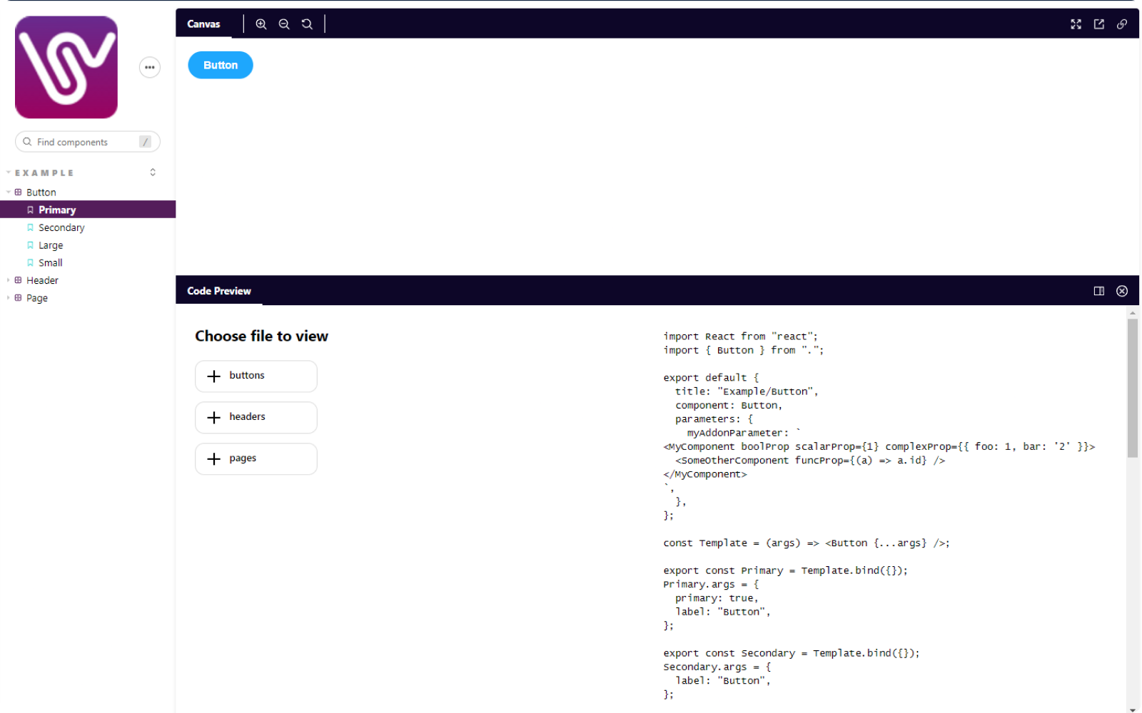
We will create an addon - storybook-addon-code-preview which adds a new panel to the Storybook UI where we can see the code of the selected file with a SyntaxHighlighter and be able to navigate to others using a 🌲View component.
2. What is Story📕
Storybook is an open-source library which extends on what React and other modern JS Frontend Frameworks bring and allows developers to code every component in isolation from the rest of the UI. There are many reasons for using a tool like Storybook as it provides a clean environment for developing & testing components which doesn't affect the main application and eases the bridge between development and design since it encourages sharing progress through hosting an entire Storybook on the web. It's very loved by Design Systems as it's amazing at showcasing the functionality of an entire Component Library.

3. What are Addons
Let's not get to into details and jump straight to the coolest feature ADDONS. Like in most similar software such as Figma, VSCode, Blender, and many others you can install and configure third party extensions (or plugins) called addons which can add to the already many features of Storybook. For Snapshot & Component Testing & Deployment there is Chromatic, for Figma & Adobe XD Integrations there is the Designs Addon and a ton more. What is even more interesting is that anyone can use the provided Addon API and develop unique addons to feature every possible need one might have.

4. Creating an addon
If you want to develop a Storybook Addon you should first check the https://storybook.js.org/addons library as it's likely someone already made it. Otherwise let's dive into the Addon Creation Guide.
You may use the addon kit template to kickstart the project with all necessary files and directory structure although I'll remove many files as they are not mandatory for this guide.
First edit package.json to contain the addon metadata that Storybook API will use to register your addon to the catalog. Do this from the start as you may forget to do this before publishing to NPM and wonder why it's not picked up on the Addon Catalog.
{
  "name": "your-amazing-addon",
  "version": "0.0.0",
  "description": "What your amazing addon does",
  "keywords": [
    "storybook-addons",
    "style",
    "test"
  ],
 "peerDependenciesMeta": {
    "react": {
      "optional": true
    },
    "react-dom": {
      "optional": true
    }
  },
  "publishConfig": {
    "access": "public"
  },
  "storybook": {
    "displayName": "Your amazing addon name,
    "supportedFrameworks": [
      "react" // add others if confirmed to work
    ]
  }
// Rest of package.json
}
Next up we'll configure babel to transpile our addon code into ES5 ready module to be added to any Storybook after buld script.
module.exports = {
  presets: ["@babel/preset-env", "@babel/preset-react"],
  // optional plugins if needed
  plugins: [
    "@babel/plugin-proposal-class-properties",
    "@babel/plugin-proposal-private-methods",
  ],
};
Let's also add npm build script to package.json.
"scripts": {
    "build": "babel ./src --out-dir ./dist"
    // other scripts
 }
In src we'll modify the constants file to include globally needed values.
export const ADDON_ID = "storybook/code-preview";
export const TOOL_ID = `${ADDON_ID}/tool`;
export const PANEL_ID = `${ADDON_ID}/panel`;

export const EVENTS = {
  RESULT: `${ADDON_ID}/result`,
  REQUEST: `${ADDON_ID}/request`,
  CLEAR: `${ADDON_ID}/clear`,
};
In order for Storybook to register our addon we need to create a preset.js file or a preset folder with an index.js, manager.js and preview.js. I'll go with the latter as it's a cleaner more modern approach.
preset/index.js should look like this
const path = require("path");

module.exports = {
  config: function (entry = []) {
    return [...entry, require.resolve("./preview")];
  },
  managerEntries: function (entry = []) {
    return [...entry, require.resolve("./manager")];
  }
};
Before proceeding to update preset/manager.js & preset/preview.js we should get to the 'clever' part of the addon and get our hands dirty with Webpack's amazingly complicate custom plugins and loaders(kidding 💜 Webpack).
A Webpack plugin allows a developer to write their own custom logic to occur at build time having access to all lower level features of webpack such as tapping into the raw/compiled source files and many others. Our plugin called CodePlugin will read the sources loaded in the cache object through our custom loader and write them to rawSources.json to be injected in the addon.
const cache = require("./cache");

let sourceId = 0;
let previousFiles = {};

class SourcePlugin {
  apply(compiler) {
    compiler.hooks.entryOption.tap("Code Preview Plugin", () => {
      cache.cleanCache();
    });
    compiler.hooks.emit.tapAsync(
      "Code Preview Plugin",
      (compilation, callback) => {
        const data = {
          files: {
            ...previousFiles,
            ...cache.getSources(),
          },
          id: sourceId++,
        };
        previousFiles = data.files;
        const sources = JSON.stringify(data);
        cache.cleanCache();
        compilation.assets["rawSources.json"] = {
          source: () => sources,
          size: () => sources.length,
        };
        callback();
      }
    );
  }
}

module.exports = SourcePlugin;
In order to read the files and load them into the SourcePlugin we can write a sourceLoader which saves them to the cache object.
const cache = require("./cache");

module.exports = function sourceLoader(source) {
  const opts = this.query || {};
  const { roots = [], compiled } = opts;
  const path = this.resourcePath;
  for (const root of roots) {
    if (!root || (path.includes(root) && !path.includes("node_modules"))) {
      console.log(`Loaded file`, root, path);
      cache.register(
        path.substr(path.indexOf(root) + root.length),
        source,
        compiled,
      );
    }
  }
  return path.match(".test.") && compiled ? "" : source;
};
Cache object to store sources between loader and plugin.
var cache = {};

module.exports = {
  register(path, source, compiled) {
    if (!cache[path]) {
      cache[path] = {};
    }
    cache[path][compiled ? "compiled" : "raw"] = source;
  },
  getSources() {
    return cache;
  },
  cleanCache() {
    cache = {};
  },
};
Finally we can add the custom plugins and loader to the Storybook Webpack Config by overriding the webpackFinal key in preset/index.js
const path = require("path");
const CodePlugin = require("../utils/CodePlugin");

module.exports = {
  config: function (entry = []) {
    return [...entry, require.resolve("./preview")];
  },
  managerEntries: function (entry = []) {
    return [...entry, require.resolve("./manager")];
  },
  // ADDED HERE
  webpackFinal: function (config, { configType }) {
    config.module.rules.push({
      test: /\.jsx?$|\.tsx?$|\.ts$|\.css$/, // files to be loaded into cache
      exclude: /(node_modules)/,
      use: [
        {
          loader: path.resolve(__dirname, "../utils/sourceLoader.js"),
          options: { roots: ["components"] },
        },
      ],
    });
    config.plugins.push(new CodePlugin());
    // prevent filename mangling (which b0rks source file switching)
    config.mode = "development";
    // prevent minification
    config.optimization.minimizer = [];
    // hide warnings
    config.stats = { warnings: false, modules: false };
    config.performance = { hints: false };
    config.devServer = { stats: "errors-only" };
    // Return the altered config
    return config;
  },
};
Using the variables defined in constants.js and the rawSources.json file we can register the addon and add the Panel containing our yet to be defined UI.
import { addons, types } from "@storybook/addons";
import { ADDON_ID, PANEL_ID } from "../constants";
import PreviewCodePanel from "../components/Panel"; // to be added next
import React from "react";

let currentId;

// Register the addon
addons.register(ADDON_ID, (api) => {
  const channel = api.getChannel();
  let rawSources;
  function fetchSources() {
    fetch("./rawSources.json")
      .then((response) => response.json())
      .then((data) => {
        // this will notify the panel for updates to the rawSources
        if (!rawSources || currentId !== data.id) {
          currentId = data.id;
          rawSources = data.files;
          channel.emit("code-preview/rawSources", data.files);
        }
      })
      .catch((error) => {
        console.log(`Raw sources error`, error);
      });
  }
  fetchSources();

  // Register the panel
  addons.add(PANEL_ID, {
    type: types.PANEL,
    title: "Code Preview",
    route: ({ storyId }) => `/code-preview/${storyId}`,
    match: ({ viewMode }) => viewMode === "story",
    render: ({ active }) => (
      <PreviewCodePanel
        channel={addons.getChannel()} // pass channel to listen for changes
        api={api}
        active={active}
        rawSources={rawSources}
      />
    ),
  });
});
We may create a decorator which can be enabled globally to add the feature to all written stories in preset/preview.js.
import addons, { makeDecorator } from "@storybook/addons";

export const decorators = [
  makeDecorator({
    name: "withCodePreview",
    parameterName: "code-preview",
    wrapper: (getStory, context) => {
      const channel = addons.getChannel();
      channel.emit("code-preview/selectedStory", context.parameters.fileName);
      return getStory(context);
    },
  }),
The Addon Creation API allows us to add Panels or Tabs to the default UI and for the purpose of this addon we'll need Panel, FileTree and SyntaxHighlighter components.

The panel will load the rawSources through the channel we provided through props and send them to the TreeView component and SyntaxHighlighter.
import path from "path";
import React, { useEffect, useState } from "react";
import FileTree from "./FileTree";
import SyntaxHighlighter from "./SyntaxHighlighter";

const Panel = (props) => {
  const { channel, rawSources: rawSourcesFromProps } = props;
  const [fileState, setFileState] = useState({ history: [], idx: 0 });
  const filePath = fileState.history[fileState.idx] || "";
  const [rawSources, setRawSources] = useState(rawSourcesFromProps);

  const handleFileChange = (path, rs) => {
    if (rs) {
      const actualPath = matchPathToSource(path, rs);
      if (actualPath && actualPath !== filePath) {
        const newHistory = fileState.history
          .slice(0, fileState.idx + 1)
          .concat(actualPath);
        const newIdx = newHistory.length - 1;
        setFileState({ history: newHistory, idx: newIdx });
      } else {
        console.warn(
          "WARNING! Selected source path not found among rawSources",
          path,
        );
      }
    }
  };

  const handleLinkClick = (p) => {
    const rel = path.join(filePath.replace(/\/[^/]*$/, "/"), p);
    const found = [
      "/index.jsx",
      "/index.js",
      "/index.tsx",
      "/index.ts",
      ".jsx",
      ".js",
      ".css",
      ".tsx",
      ".ts",
      "",
    ]
      .map((suff) => rel + suff)
      .find((p) => !!rawSources[p]);
    if (found) {
      handleFileChange(found, rawSources);
    } else {
      console.warn("WARNING - could not find corresponding file in list", rel);
    }
  };

  useEffect(() => {
    channel.on("code-preview/rawSources", (newRawSources) => {
      channel.removeListener("code-preview/rawSources");
      setRawSources(newRawSources);
      if (filePath) {
        handleFileChange(filePath, newRawSources);
      }
    });
    return () => channel.removeListener("code-preview/rawSources");
  }, [setRawSources]);

  useEffect(() => {
    channel.on("code-preview/selectedStory", (p) => {
      if (rawSources) {
        var path = p.substring(p.lastIndexOf("/") + 1);
        handleFileChange(path, rawSources);
      }
    });
    return () => channel.removeListener("code-preview/selectedStory");
  }, [rawSources]);

  if (!props.active) return null;
  if (!rawSources) return <span>...loading...</span>;

  const files = Object.keys(rawSources).sort();
  return (
    <div style={{ padding: "5px", display: "flex" }} className="sourcePanel">
      <FileTree
        files={files}
        filePath={filePath}
        onFileChange={(path) => {
          handleFileChange(path, rawSources);
        }}
      />
      <SyntaxHighlighter
        language={filePath.match(/.css$/) ? "css" : "javascript"}
        code={(rawSources[filePath] || {})["raw"] || ""}
        onLinkClick={handleLinkClick}
      />
    </div>
  );
};

export default Panel;

function matchPathToSource(path, rawSources) {
  const files = Object.keys(rawSources);
  return files.find((file) => file.includes(path) || path.includes(file));
}
In order to create a pretty code previewer we can use the almighty react-syntax-highlighter and npm install react-syntax-highlighter to customise it to suit our needs. You can check the code here SyntaxHighlighter.tsx.
And finally the FileTree component which allows for source files navigation & preview, I'll just attach a link here since it's a rather long component and not really the main topic of this guide FileTree.jsx .
With all of those combined we can run npm run storybook and we should see a new panel in the lower half of the screen.
5. Deploying the addon
As it's very well explained here if you want your amazing addon to be showcased on the official Storybook Addon Catalog you should first publish it to npm.
To seamlessly deploy changes on every push to our Github repository and bump versions automatically we can use auto.
First we install as a devDependency npm install --save-dev auto.
And configure a script to be run with a Githup action
"scripts": {
   "release": "npm run build && auto shipit"
   // rest of package.json
}
To add a custom Github workflow we can create .github/workflows folder at the root of our project and release.yml file containing something along the lines of this.
name: Release

on: [push]

jobs:
  release:
    runs-on: ubuntu-latest
    if: "!contains(github.event.head_commit.message, 'ci skip') && !contains(github.event.head_commit.message, 'skip ci')"
    steps:
      - uses: actions/checkout@v2

      - name: Prepare repository
        run: git fetch --unshallow --tags

      - name: Use Node.js 14.x
        uses: actions/setup-node@v1
        with:
          node-version: 14.x

      - name: Install dependencies
        uses: bahmutov/npm-install@v1

      - name: Create Release
        env:
          GITHUB_TOKEN: ${{ secrets.GITHUB_TOKEN }}
          NPM_TOKEN: ${{ secrets.NPM_TOKEN }}
        run: |
          yarn release
After that when we push the updates we need to generate an NPM token and add it to Github Secrets as NPM_TOKEN.
Now you are all set and your addon is ready to be seen by the entire 🌍.
6. Credits
Many thanks to krawaller 😍 who wrote an inspiring article regarding creating a Source Code View Addon a while back as he came up with the idea of "hacking" the Storybook webpack config with custom plugin and loader. Please check his post here.
If you learned anything interesting in this article, make sure to put a 💜 on it.


